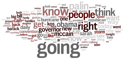
Matthew Ericson at the New York Times did a really cool visualization last week, "The Words They Used", comparing the most frequently used words at the Democratic and Republican Conventions (from the article, "Republicans were more likely to talk about businesses and taxes, while Democrats were more likely to mention jobs or the economy.")
The word "actually" on television
Jeff Jarvis wrote a blog post last week about how he thought the word "actually" was overused on television. Here's the post (he lost a bunch of posts and hasn't restored them all):
SnapStream generates buzz at George Washington University
George Washington University’s independent student newspaper, the GW Hatchet, reports on the use of our SnapStream Enterprise product in the School of Media and Public Affairs. The story highlights the impact that SnapStream's television search technology will have at GWU's public policy and journalism schools, making it so that faculty and students can search television broadcasts for educational research and analysis. A few choice quotes:
What is SnapStream? There's an unlimited amount of video content out there: 24/7 news channels, breaking news events, sports, talk shows, awards galas, entertainment shows, and so much more.
SnapStream makes a real-time news and media search engine that makes it fast and easy to find the video moments that support our customers telling great stories.
Posts by Topic
- General TV Search (165)
- Technology Development (28)
- Support Corner (26)
- Television and Film Production (26)
- Social TV (24)
- Broadcast Monitoring (23)
- TV Trends (23)
- Tradeshows (23)
- news (23)
- Government (19)
- Release (19)
- Fun (16)
- Journalism (16)
- Politics (16)
- TV search (16)
- Education (14)
- Newsmedia (13)
- new product (13)
- updates (13)
- Entertainment (11)
- Video Clips (10)
- broadcast compliance (10)
- broadcast monitoring and compliance (10)
- social engagement (10)
- Twitter TV clips (8)
- Local TV stations (7)
- TV Monitoring/PR (7)
- Meet Team SnapStream (6)
- SnapStream News (6)
- Social in Sports (6)
- social sharing (6)
- livecut (5)
- City Government (4)
- International (4)
- Sports (4)
- media monitoring (4)
- snappytv (4)
- thought leadership (4)
- Addressable Advertising (3)
- CALM Act (3)
- Case Study (3)
- Context (3)
- Facebook TV clips (3)
- LKFS (3)
- Resources (3)
- SnapStream Cloud (3)
- SnapStream Enterprise (3)
- Streams (3)
- TV closed-captioning search (3)
- avoidance (3)
- clipping (3)
- ditigal (3)
- loudness compliance (3)
- misinformation (3)
- snappytv alternative (3)
- snappytv replacement (3)
- television monitoring (3)
- 8.3 (2)
- 8.5 (2)
- Advertising (2)
- How-to (2)
- Influencers (2)
- Jschool (2)
- News Satire (2)
- Pew Research (2)
- Radio Production (2)
- SnapStream (2)
- SnapStream Advanced (2)
- The Colbert Report (2)
- The Daily Show with Jon Stewart (2)
- Training (2)
- blog post (2)
- covid (2)
- covid-19 (2)
- election (2)
- live clipping (2)
- live video (2)
- loudness monitoring (2)
- media technology (2)
- trust (2)
- veracity (2)
- 8.1 (1)
- 8.2 (1)
- 9.1 (1)
- 9.2 (1)
- 9.3 (1)
- 9.4 (1)
- AEJMC (1)
- Barack Obama (1)
- Bloomberg TV (1)
- Fake News (1)
- H.264 (1)
- HLS (1)
- Hockey (1)
- Holiday (1)
- Houston tech (1)
- ISTE (1)
- Infotainment (1)
- International News Satire TV Shows (1)
- Lebron James (1)
- Libary (1)
- Local TV News (1)
- MVPD (1)
- MVPDs (1)
- Market Makers (1)
- Merging (1)
- Multi-viewer (1)
- NHL (1)
- Nancy Jennings (1)
- News Satire TV Shows in Other Countries (1)
- ONA21 (1)
- PIO (1)
- Playlists (1)
- Quality Assurance (1)
- RTMP (1)
- Reviewing Clips (1)
- STB (1)
- Satirical TV Shows (1)
- SnapStream 9.3 (1)
- SnapStream 9.4 (1)
- SnapStream 9.5 (1)
- SnapStream Interview (1)
- SnapStream Server (1)
- St. Louis Blues (1)
- Summer News (1)
- Super Bowl Commercials (1)
- Switch and Save (1)
- Uploading (1)
- Volicon (1)
- Webplayer (1)
- World Cup (1)
- Zoom (1)
- accessibility in broadcast (1)
- blogging (1)
- broadcast accessibility (1)
- broadcast tv accessibility (1)
- cable networks (1)
- closed captioning (1)
- closed captioning compliance (1)
- closed captions (1)
- content analysis (1)
- cto (1)
- customer appreciation (1)
- customers (1)
- debates (1)
- deep (1)
- deepfake (1)
- director of technology (1)
- edtech (1)
- encoder (1)
- explainer (1)
- fake (1)
- fan engagement (1)
- fire department (1)
- free server maintenance (1)
- innovation (1)
- live event (1)
- local tv (1)
- managed tv (1)
- media (1)
- monetization (1)
- online (1)
- podcast (1)
- police department (1)
- press release (1)
- public information officer (1)
- ratings (1)
- recording (1)
- remote work (1)
- set-top box (1)
- sharing (1)
- snapstream 9.6 (1)
- transmission engineering (1)
- tv alerts (1)
- tv networks (1)
- watchespn app (1)
- webinar (1)
- workspace (1)

